
Radiologex is a blockchain-powered platform for secure medical data exchange and collaboration. It streamlines workflows for healthcare professionals, ensuring privacy and efficiency.
Radiologex is a blockchain-powered platform for secure medical data exchange and collaboration. It streamlines workflows for healthcare professionals, ensuring privacy and efficiency.
Radiologex is a blockchain-powered platform for secure medical data exchange and collaboration. It streamlines workflows for healthcare professionals, ensuring privacy and efficiency.
https://radiologex.com
https://radiologex.com
https://radiologex.com
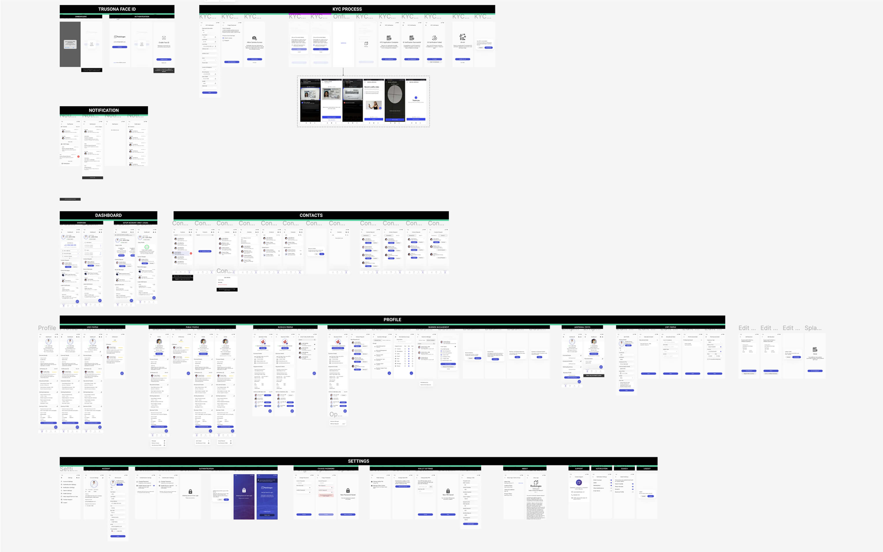
Led the end-to-end redesign of Radiologex, improving usability, accessibility, and efficiency for medical professionals.
Developed a custom design system to create a consistent, scalable UI, streamlining workflows and enhancing the user experience.
Developed a custom design system to create a consistent, scalable UI, streamlining workflows and enhancing the user experience.
Redesigned the entire web and mobile app, ensuring a cohesive experience across platforms and seamless usability on all devices.
Improved navigation and interface clarity, reducing complexity and ensuring seamless interactions for healthcare teams.
Designed secure and intuitive data management tools, improving access to patient information while maintaining compliance.
Product Designer
Product Designer
24 Months
24 Months
May, 2020 - Apr, 2022
Period
June, 2023 - June, 2024


Understanding
Research
Ideation
Hypothesis
UX Audit
Low Fidelity Wireframe
Key Features Design
Atomic Design System
Design Implementation
Belmin Salkica
Meghan Scott - Product Manager
Dev Team
Understanding
Research
Ideation
Hypothesis
UX Audit
Low Fidelity Wireframe
Key Features Design
Atomic Design System
Design Implementation
Belmin Salkica
Meghan Scott - Product Manager
Dev Team
Understanding
Research
Ideation
Hypothesis
UX Audit
Low Fidelity Wireframe
Key Features Design
Atomic Design System
Design Implementation
Belmin Salkica
Meghan Scott - Product Manager
Dev Team


We ensured the mobile app mirrored the web experience, applying the same design principles and usability improvements. Every feature was carefully adapted to mobile, maintaining consistency while optimizing for smaller screens and touch interactions.
We ensured the mobile app mirrored the web experience, applying the same design principles and usability improvements. Every feature was carefully adapted to mobile, maintaining consistency while optimizing for smaller screens and touch interactions.

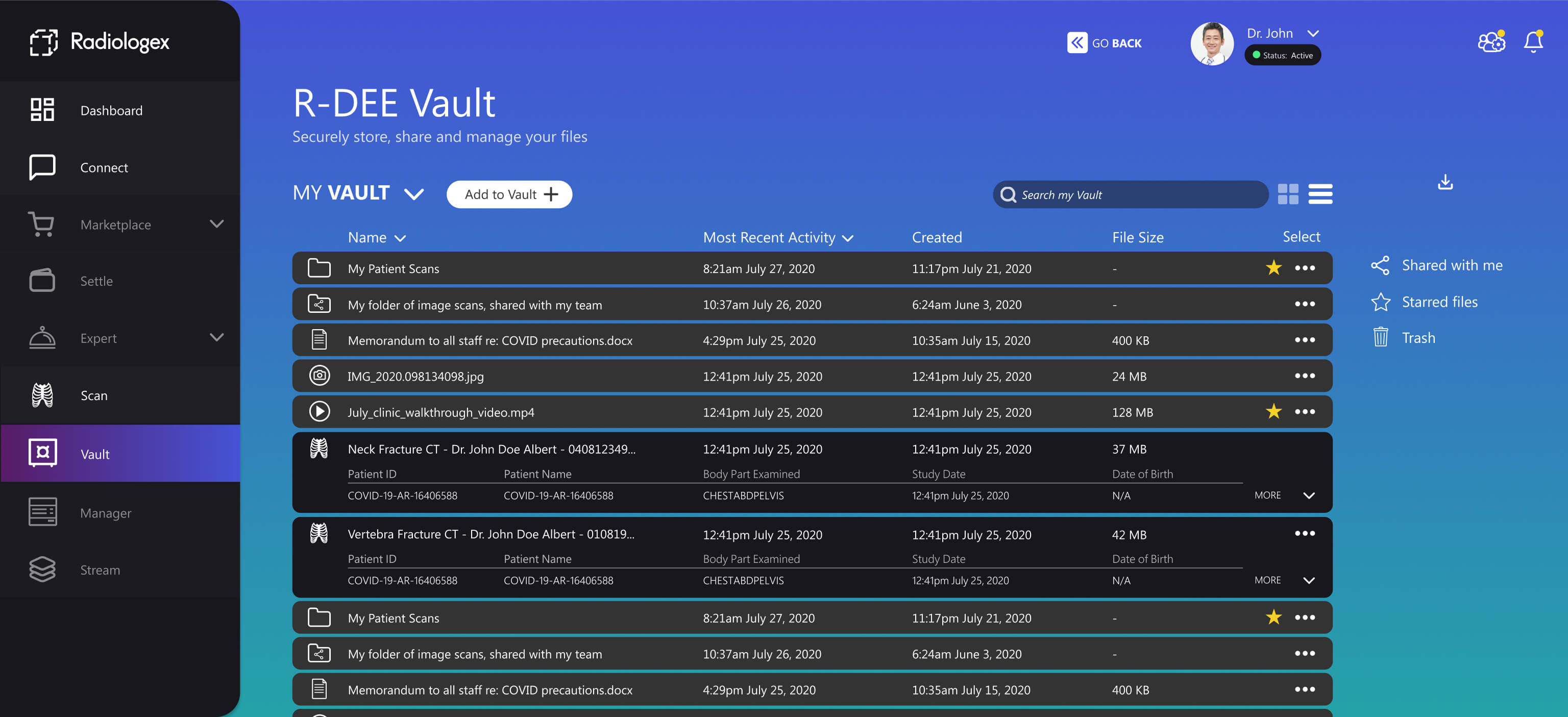
This example showcases the Card View of the Vault, offering a visual way to organize and access medical files. Unlike List View, it presents files in a grid format, making scanning, previewing, and managing documents faster and easier.
This example showcases the Card View of the Vault, offering a visual way to organize and access medical files. Unlike List View, it presents files in a grid format, making scanning, previewing, and managing documents faster and easier.
The Marketplace allows medical professionals to buy and sell equipment, but the old design lacked clarity, making it hard to compare listings and view important details at a glance. Users had to dig through multiple sections to find pricing, specifications, and seller details, slowing down decision-making.
The Marketplace allows medical professionals to buy and sell equipment, but the old design lacked clarity, making it hard to compare listings and view important details at a glance. Users had to dig through multiple sections to find pricing, specifications, and seller details, slowing down decision-making.

The Settings page allows users to manage their profile, security, notifications, and wallet settings in one place, ensuring a seamless and secure experience.
The Settings page allows users to manage their profile, security, notifications, and wallet settings in one place, ensuring a seamless and secure experience.

The Connect feature allows medical professionals to communicate in real-time through secure messaging. Users can chat, share medical files, and collaborate instantly, ensuring seamless teamwork and faster decision-making.
The Connect feature allows medical professionals to communicate in real-time through secure messaging. Users can chat, share medical files, and collaborate instantly, ensuring seamless teamwork and faster decision-making.

The R-DEE Settle feature streamlines financial transactions for medical professionals, offering secure payment management, invoicing, and payroll. Users can track balances, confirm transactions, and manage funds seamlessly in one place.
The R-DEE Settle feature streamlines financial transactions for medical professionals, offering secure payment management, invoicing, and payroll. Users can track balances, confirm transactions, and manage funds seamlessly in one place.


R-DEE Stream is a video hub for medical professionals, providing educational content and industry insights. The old design was cluttered, making navigation difficult and key actions unclear.
R-DEE Stream is a video hub for medical professionals, providing educational content and industry insights. The old design was cluttered, making navigation difficult and key actions unclear.
Before diving into the redesign, we needed to fully understand the platform, its features, and how users interacted with them.
Before diving into the redesign, we needed to fully understand the platform, its features, and how users interacted with them.
Before diving into the redesign, we needed to fully understand the platform, its features, and how users interacted with them.
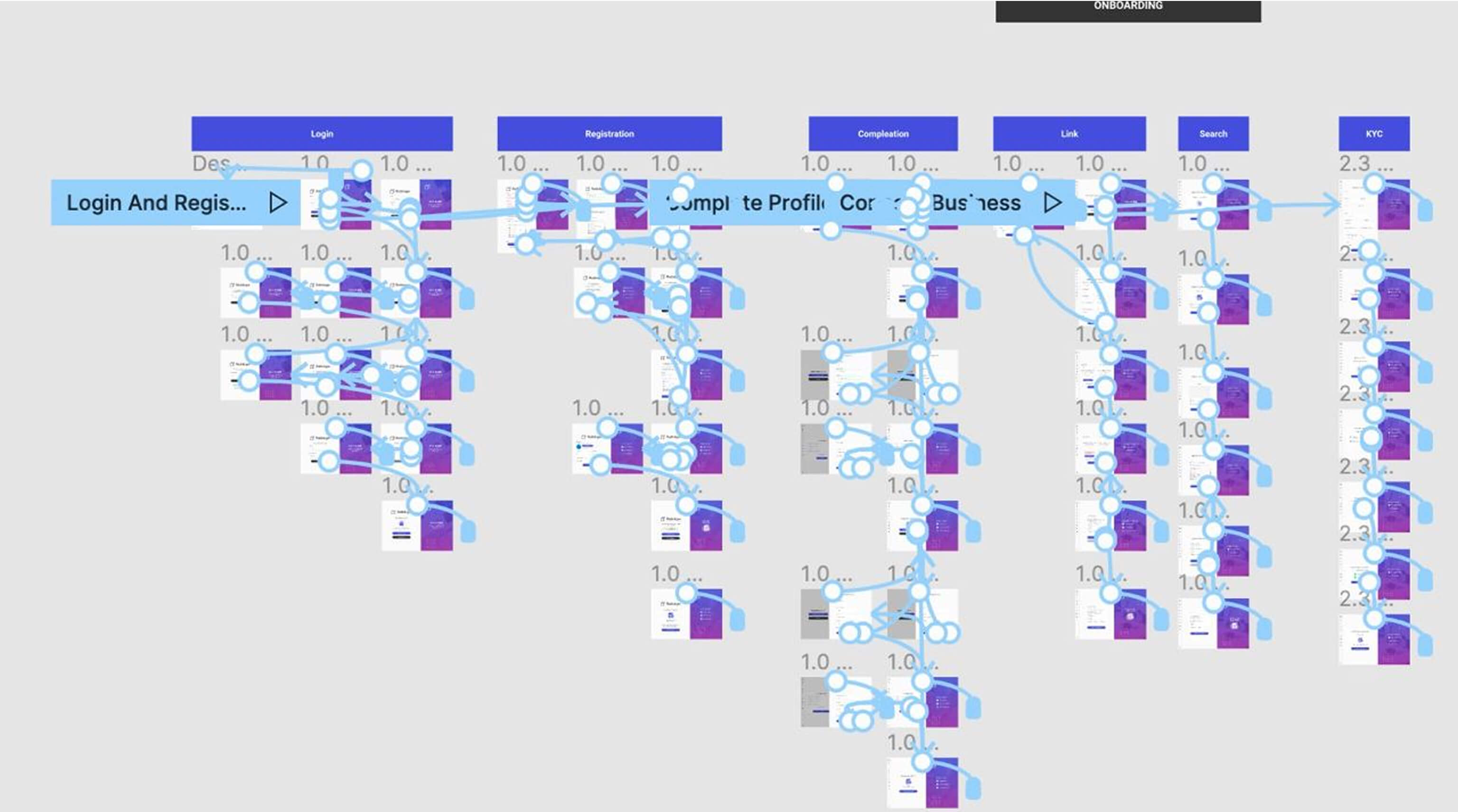
This wasn’t just about giving the app a fresh look-it was about analyzing the entire user experience, identifying pain points, and ensuring that every feature served its purpose effectively. Our first step was conducting a UX audit of the old app, where we examined navigation, workflows, and missing states.
This wasn’t just about giving the app a fresh look-it was about analyzing the entire user experience, identifying pain points, and ensuring that every feature served its purpose effectively. Our first step was conducting a UX audit of the old app, where we examined navigation, workflows, and missing states.
This wasn’t just about giving the app a fresh look-it was about analyzing the entire user experience, identifying pain points, and ensuring that every feature served its purpose effectively. Our first step was conducting a UX audit of the old app, where we examined navigation, workflows, and missing states.

We looked at how users moved through the platform, where they faced friction, and what areas needed better clarity. Each feature required its own deep dive—mapping out its current structure, evaluating usability, and spotting areas where improvements could have the biggest impact.
We looked at how users moved through the platform, where they faced friction, and what areas needed better clarity. Each feature required its own deep dive—mapping out its current structure, evaluating usability, and spotting areas where improvements could have the biggest impact.
We looked at how users moved through the platform, where they faced friction, and what areas needed better clarity. Each feature required its own deep dive—mapping out its current structure, evaluating usability, and spotting areas where improvements could have the biggest impact.
When we conducted our UX audit, we uncovered a major issues:
When we conducted our UX audit, we uncovered a major issues:
When we conducted our UX audit, we uncovered a major issues:
Navigation Issues - Key actions were hard to find, requiring too many steps.
Navigation Issues - Key actions were hard to find, requiring too many steps.
Cluttered UI – Inconsistent layouts made it difficult to scan and locate important elements.
Cluttered UI – Inconsistent layouts made it difficult to scan and locate important elements.
Cluttered UI – Inconsistent layouts made it difficult to scan and locate important elements.
Inefficient Workflows – Critical tasks were buried in unnecessary steps, slowing down user efficiency.
Inefficient Workflows – Critical tasks were buried in unnecessary steps, slowing down user efficiency.
Inefficient Workflows – Critical tasks were buried in unnecessary steps, slowing down user efficiency.
Fragmented Experience – Poor information architecture forced users to switch between multiple screens unnecessarily.
Fragmented Experience – Poor information architecture forced users to switch between multiple screens unnecessarily.
Fragmented Experience – Poor information architecture forced users to switch between multiple screens unnecessarily.

Our main goal was to simplify and streamline these flows, ensuring users could complete tasks with minimal effort. We focused on restructuring navigation, making the platform more intuitive and consistent.
Our main goal was to simplify and streamline these flows, ensuring users could complete tasks with minimal effort. We focused on restructuring navigation, making the platform more intuitive and consistent.
Our main goal was to simplify and streamline these flows, ensuring users could complete tasks with minimal effort. We focused on restructuring navigation, making the platform more intuitive and consistent.
By unifying interaction patterns across the app, we created a clear, logical experience where users could easily find and access the information they needed. The result was a more seamless workflow that significantly improved usability and efficiency.
By unifying interaction patterns across the app, we created a clear, logical experience where users could easily find and access the information they needed. The result was a more seamless workflow that significantly improved usability and efficiency.
By unifying interaction patterns across the app, we created a clear, logical experience where users could easily find and access the information they needed. The result was a more seamless workflow that significantly improved usability and efficiency.
The navigation in the original app was confusing, making it difficult for users to understand where they were and how to complete key actions. The mix of dark and light UI elements on the same screen created inconsistency, making the interface feel disjointed.
The navigation in the original app was confusing, making it difficult for users to understand where they were and how to complete key actions. The mix of dark and light UI elements on the same screen created inconsistency, making the interface feel disjointed.
The navigation in the original app was confusing, making it difficult for users to understand where they were and how to complete key actions. The mix of dark and light UI elements on the same screen created inconsistency, making the interface feel disjointed.
The Vault had several UI issues that made it difficult for medical professionals to navigate and use efficiently. The dark theme, combined with a lack of contrast, reduced readability. Users had to rely on memory rather than clear visual indicators to distinguish between different file types and statuses due to poor contrast and inconsistent iconography.
The Vault had several UI issues that made it difficult for medical professionals to navigate and use efficiently. The dark theme, combined with a lack of contrast, reduced readability. Users had to rely on memory rather than clear visual indicators to distinguish between different file types and statuses due to poor contrast and inconsistent iconography.
The Vault had several UI issues that made it difficult for medical professionals to navigate and use efficiently. The dark theme, combined with a lack of contrast, reduced readability. Users had to rely on memory rather than clear visual indicators to distinguish between different file types and statuses due to poor contrast and inconsistent iconography.
When we conducted our UX audit, we uncovered a major issues:
When we conducted our UX audit, we uncovered a major issues:
When we conducted our UX audit, we uncovered a major issues:
Poor Visual Hierarchy- Dark theme and low contrast reduced readability.
Poor Visual Hierarchy- Dark theme and low contrast reduced readability.
Lack of Clear Labels – Inconsistent layouts made it difficult to scan and locate important elements.
Lack of Clear Labels – Inconsistent layouts made it difficult to scan and locate important elements.
Lack of Clear Labels – Inconsistent layouts made it difficult to scan and locate important elements.
Unintuitive Navigation – Important functions were not clearly visible, forcing users to rely on trial and error.
Unintuitive Navigation – Important functions were not clearly visible, forcing users to rely on trial and error.
Unintuitive Navigation – Important functions were not clearly visible, forcing users to rely on trial and error.

The platform’s usability challenges weren’t limited to a single section—they were widespread. Inconsistent design, poor navigation, and a lack of clear hierarchy made even basic tasks frustrating. Users struggled to find key actions, workflows were inefficient, and the absence of a standardized design system led to confusion across different screens.
The platform’s usability challenges weren’t limited to a single section—they were widespread. Inconsistent design, poor navigation, and a lack of clear hierarchy made even basic tasks frustrating. Users struggled to find key actions, workflows were inefficient, and the absence of a standardized design system led to confusion across different screens.
The platform’s usability challenges weren’t limited to a single section—they were widespread. Inconsistent design, poor navigation, and a lack of clear hierarchy made even basic tasks frustrating. Users struggled to find key actions, workflows were inefficient, and the absence of a standardized design system led to confusion across different screens.
When we conducted our UX audit, we uncovered a major issues:
When we conducted our UX audit, we uncovered a major issues:
When we conducted our UX audit, we uncovered a major issues:
Poor Visual Hierarchy - Poor spacing and inconsistent styling made it hard to scan.
Lack of Section Hierarchy – No clear separation between primary and secondary actions.
Lack of Section Hierarchy – No clear separation between primary and secondary actions.
Lack of Section Hierarchy – No clear separation between primary and secondary actions.
No Standardized Components – Every form had a different layout, increasing learning time.
No Standardized Components – Every form had a different layout, increasing learning time.
No Standardized Components – Every form had a different layout, increasing learning time.

One of the most complex areas we analyzed was the Marketplace, where medical professionals could buy and sell high-value equipment. Unlike traditional e-commerce, these transactions involved multiple steps, security checks, and dispute resolution processes, all of which needed to be intuitive and seamless.
One of the most complex areas we analyzed was the Marketplace, where medical professionals could buy and sell high-value equipment. Unlike traditional e-commerce, these transactions involved multiple steps, security checks, and dispute resolution processes, all of which needed to be intuitive and seamless.
One of the most complex areas we analyzed was the Marketplace, where medical professionals could buy and sell high-value equipment. Unlike traditional e-commerce, these transactions involved multiple steps, security checks, and dispute resolution processes, all of which needed to be intuitive and seamless.
Overcomplicated Purchase Process - Users had to switch between multiple screens just to place an order.
Overcomplicated Purchase Process - Users had to switch between multiple screens just to place an order.
Lack of Guidance – No clear progress indicators or feedback after each step.
Lack of Guidance – No clear progress indicators or feedback after each step.
Lack of Guidance – No clear progress indicators or feedback after each step.
Confusing Transaction Flow – Payment verification and confirmation were hidden in separate sections, causing confusion.
Confusing Transaction Flow – Payment verification and confirmation were hidden in separate sections, causing confusion.
Confusing Transaction Flow – Payment verification and confirmation were hidden in separate sections, causing confusion.
By mapping out these gaps, we created a structured, user-friendly workflow that clarified transaction progress, introduced missing states, and ensured that buyers and sellers always knew their next steps.
By mapping out these gaps, we created a structured, user-friendly workflow that clarified transaction progress, introduced missing states, and ensured that buyers and sellers always knew their next steps.
By mapping out these gaps, we created a structured, user-friendly workflow that clarified transaction progress, introduced missing states, and ensured that buyers and sellers always knew their next steps.
Moving from the UX audit to the redesign phase, our goal was to overhaul the entire platform while prioritizing the most critical features first.
Moving from the UX audit to the redesign phase, our goal was to overhaul the entire platform while prioritizing the most critical features first.
Moving from the UX audit to the redesign phase, our goal was to overhaul the entire platform while prioritizing the most critical features first.
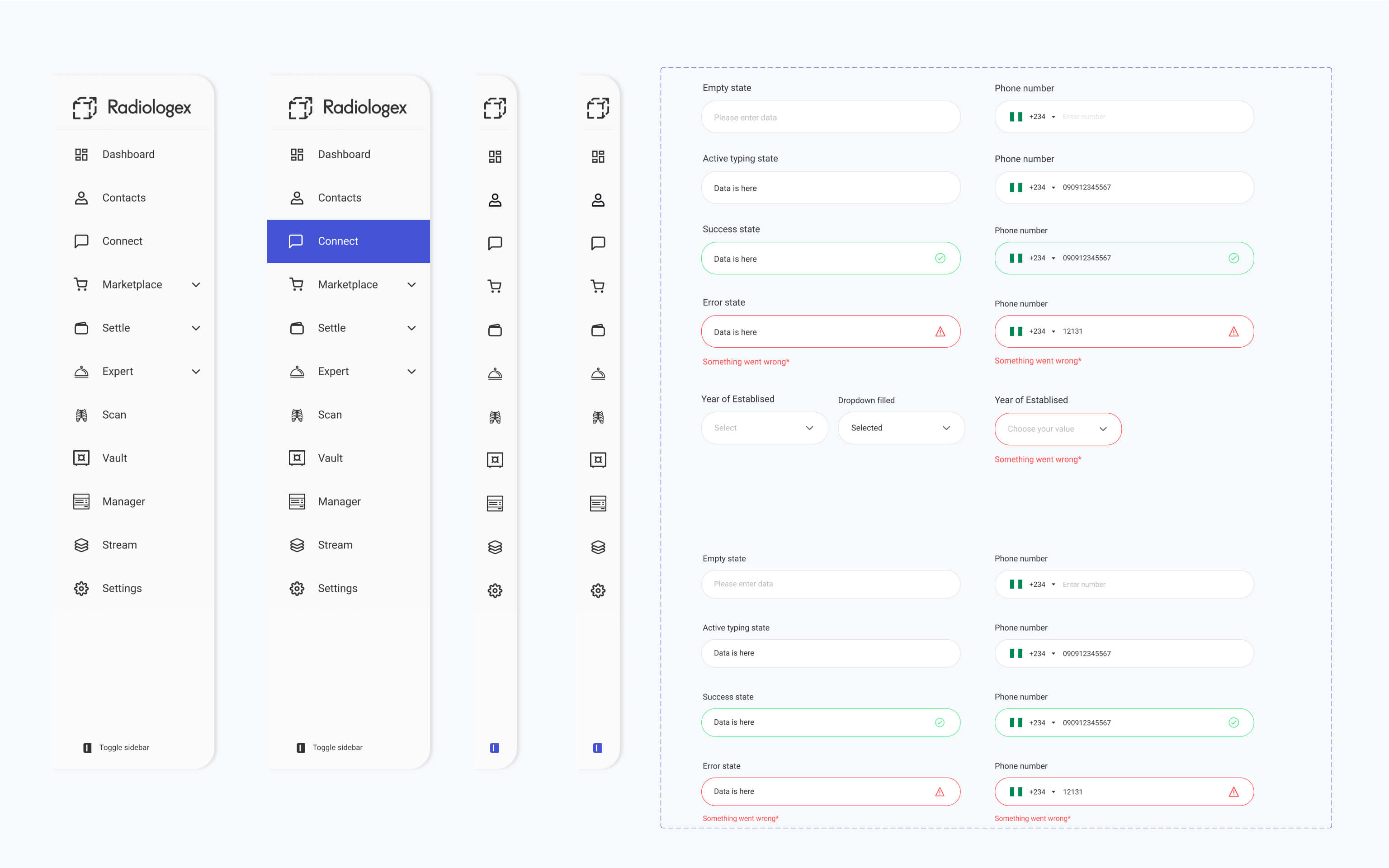
To tackle this, we took an Atomic Design approach, breaking down the interface into smaller, reusable components—buttons, cards, input fields, and navigation elements. By redesigning each component systematically, we created a cohesive and scalable design system that could be applied across the platform.
To tackle this, we took an Atomic Design approach, breaking down the interface into smaller, reusable components—buttons, cards, input fields, and navigation elements. By redesigning each component systematically, we created a cohesive and scalable design system that could be applied across the platform.
To tackle this, we took an Atomic Design approach, breaking down the interface into smaller, reusable components—buttons, cards, input fields, and navigation elements. By redesigning each component systematically, we created a cohesive and scalable design system that could be applied across the platform.
This approach allowed us to maintain consistency, streamline updates, and enhance usability across web and mobile. With a refined design language and improved interface clarity, we transformed Radiologex into a modern, user-friendly platform that meets the needs of medical professionals while ensuring future scalability.
This approach allowed us to maintain consistency, streamline updates, and enhance usability across web and mobile. With a refined design language and improved interface clarity, we transformed Radiologex into a modern, user-friendly platform that meets the needs of medical professionals while ensuring future scalability.
This approach allowed us to maintain consistency, streamline updates, and enhance usability across web and mobile. With a refined design language and improved interface clarity, we transformed Radiologex into a modern, user-friendly platform that meets the needs of medical professionals while ensuring future scalability.

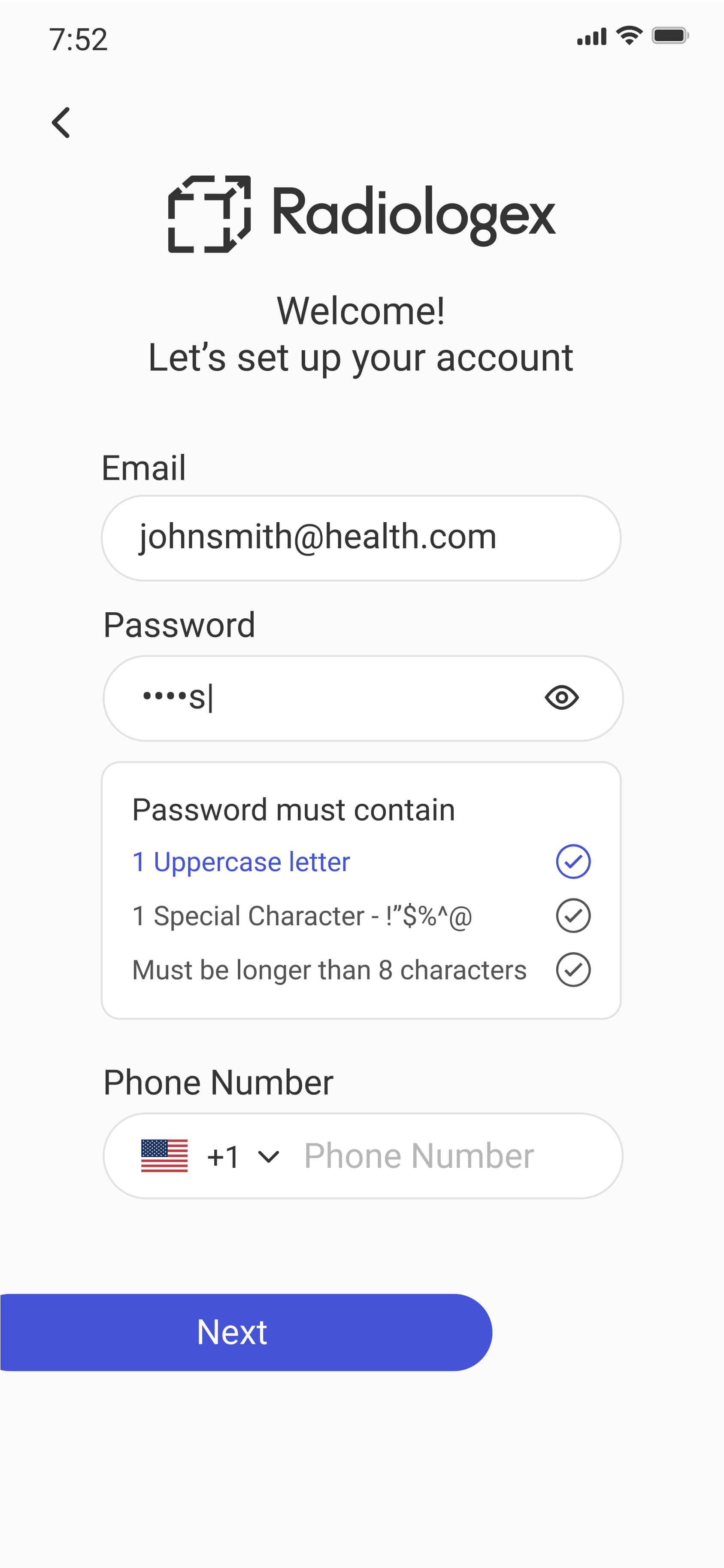
During the redesign of Radiologex, our priority was to ensure a seamless and consistent experience across both web and mobile platforms. The old design lacked structure, making it difficult for users to switch between devices without confusion.
During the redesign of Radiologex, our priority was to ensure a seamless and consistent experience across both web and mobile platforms. The old design lacked structure, making it difficult for users to switch between devices without confusion.
During the redesign of Radiologex, our priority was to ensure a seamless and consistent experience across both web and mobile platforms. The old design lacked structure, making it difficult for users to switch between devices without confusion.
To solve this, we established a unified design language that applied to every screen, component, and interaction. Using an Atomic Design approach, we built reusable UI components that worked across both platforms, ensuring that elements like buttons, navigation patterns, and data displays remained consistent.
To solve this, we established a unified design language that applied to every screen, component, and interaction. Using an Atomic Design approach, we built reusable UI components that worked across both platforms, ensuring that elements like buttons, navigation patterns, and data displays remained consistent.
To solve this, we established a unified design language that applied to every screen, component, and interaction. Using an Atomic Design approach, we built reusable UI components that worked across both platforms, ensuring that elements like buttons, navigation patterns, and data displays remained consistent.

The mobile app presented unique challenges that needed careful refinement. Small tap targets made interactions frustrating, while inconsistent spacing and dense layouts hindered readability.
The mobile app presented unique challenges that needed careful refinement. Small tap targets made interactions frustrating, while inconsistent spacing and dense layouts hindered readability.
The mobile app presented unique challenges that needed careful refinement. Small tap targets made interactions frustrating, while inconsistent spacing and dense layouts hindered readability.
Navigation was another issue—patterns that worked on the web didn’t translate well to mobile, forcing extra steps to find key features. A lack of hierarchy further slowed users down.
Navigation was another issue—patterns that worked on the web didn’t translate well to mobile, forcing extra steps to find key features. A lack of hierarchy further slowed users down.
Navigation was another issue—patterns that worked on the web didn’t translate well to mobile, forcing extra steps to find key features. A lack of hierarchy further slowed users down.
We optimized touch targets, improved spacing, and restructured navigation to be more intuitive for smaller screens. These refinements made interactions smoother and ensured a seamless experience across devices.
We optimized touch targets, improved spacing, and restructured navigation to be more intuitive for smaller screens. These refinements made interactions smoother and ensured a seamless experience across devices.
We optimized touch targets, improved spacing, and restructured navigation to be more intuitive for smaller screens. These refinements made interactions smoother and ensured a seamless experience across devices.
The Radiologex redesign transformed a cluttered, inefficient platform into an intuitive, modern solution tailored for medical professionals. By improving navigation, simplifying workflows, and ensuring a cohesive experience across web and mobile, we enabled faster access to critical information while reducing cognitive load.
The Radiologex redesign transformed a cluttered, inefficient platform into an intuitive, modern solution tailored for medical professionals. By improving navigation, simplifying workflows, and ensuring a cohesive experience across web and mobile, we enabled faster access to critical information while reducing cognitive load.
The Radiologex redesign transformed a cluttered, inefficient platform into an intuitive, modern solution tailored for medical professionals. By improving navigation, simplifying workflows, and ensuring a cohesive experience across web and mobile, we enabled faster access to critical information while reducing cognitive load.
The new design system created a scalable foundation, allowing for easier updates and future feature expansion. Doctors and medical staff could now complete tasks more efficiently, leading to reduced support inquiries and a higher adoption rate.
The new design system created a scalable foundation, allowing for easier updates and future feature expansion. Doctors and medical staff could now complete tasks more efficiently, leading to reduced support inquiries and a higher adoption rate.
The new design system created a scalable foundation, allowing for easier updates and future feature expansion. Doctors and medical staff could now complete tasks more efficiently, leading to reduced support inquiries and a higher adoption rate.

Through streamlined interactions and a more user-friendly layout, the platform significantly enhanced collaboration, accessibility, and efficiency, aligning with industry standards while improving overall satisfaction. This redesign not only modernized Radiologex but also set a new benchmark for usability in healthcare SaaS solutions.
Through streamlined interactions and a more user-friendly layout, the platform significantly enhanced collaboration, accessibility, and efficiency, aligning with industry standards while improving overall satisfaction. This redesign not only modernized Radiologex but also set a new benchmark for usability in healthcare SaaS solutions.
Through streamlined interactions and a more user-friendly layout, the platform significantly enhanced collaboration, accessibility, and efficiency, aligning with industry standards while improving overall satisfaction. This redesign not only modernized Radiologex but also set a new benchmark for usability in healthcare SaaS solutions.


Beyond improving usability, the redesign also had a direct impact on business outcomes. By streamlining workflows and reducing friction in key interactions, we saw an increase in user engagement and overall platform efficiency. Medical professionals could now complete tasks with fewer steps, leading to reduced time spent on administrative work and more focus on patient care.
Beyond improving usability, the redesign also had a direct impact on business outcomes. By streamlining workflows and reducing friction in key interactions, we saw an increase in user engagement and overall platform efficiency. Medical professionals could now complete tasks with fewer steps, leading to reduced time spent on administrative work and more focus on patient care.
Beyond improving usability, the redesign also had a direct impact on business outcomes. By streamlining workflows and reducing friction in key interactions, we saw an increase in user engagement and overall platform efficiency. Medical professionals could now complete tasks with fewer steps, leading to reduced time spent on administrative work and more focus on patient care.
By aligning the redesign with industry best practices and modern UX standards, we set a foundation for future growth. With a strong design system in place, Radiologex can now scale efficiently, integrate new features smoothly, and maintain a consistent experience across all platforms.
By aligning the redesign with industry best practices and modern UX standards, we set a foundation for future growth. With a strong design system in place, Radiologex can now scale efficiently, integrate new features smoothly, and maintain a consistent experience across all platforms.
By aligning the redesign with industry best practices and modern UX standards, we set a foundation for future growth. With a strong design system in place, Radiologex can now scale efficiently, integrate new features smoothly, and maintain a consistent experience across all platforms.
This transformation not only improved the current platform but also positioned it as a benchmark for usability in healthcare SaaS solutions.
This transformation not only improved the current platform but also positioned it as a benchmark for usability in healthcare SaaS solutions.
This transformation not only improved the current platform but also positioned it as a benchmark for usability in healthcare SaaS solutions.