


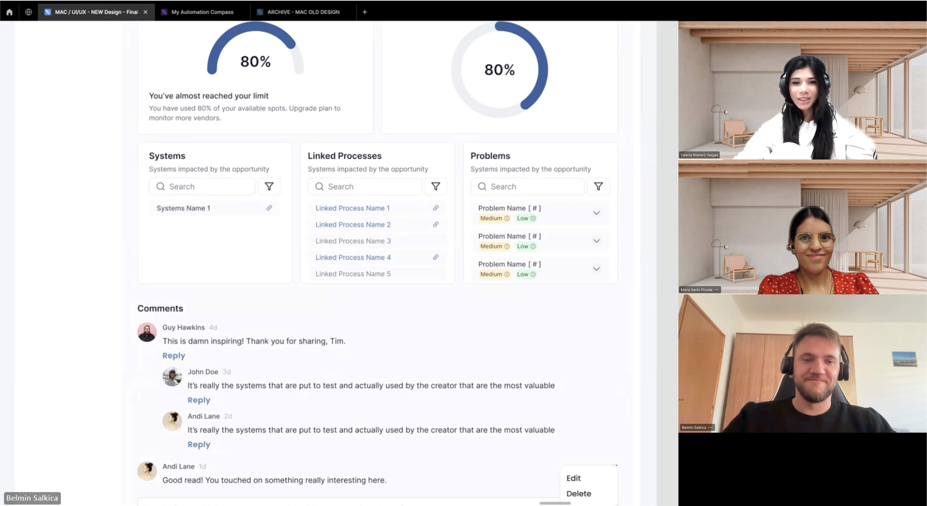


“Working with Belmin on the Business Compass project was a great experience. He helped us simplify a complex platform by improving key features and user flows. His strong collaboration with both product and development teams ensured smooth handoffs and consistent results. Belmin’s structured approach and attention to detail made a real difference in the success of the redesign.”

Valeria Romero Vargas
Senior Program Manager at Salient Process